


Poor letter spacing can ruin (or make hilarious) even the best thought-out text, as these examples demonstrate. If these mistakes are not the result of an errant space, then they might be result of automatic “kerning,” which is the process of adjusting the spacing between characters.
When type was printed using cast metal, parts that needed to overlap adjacent letters hung off the edge. Computer typefaces might have manual, automatic, or no kerning whatsoever; no kerning can make it appear that there is a space between letters when there, while automatic kerning produces mixed results.
(h/t: justsomething)
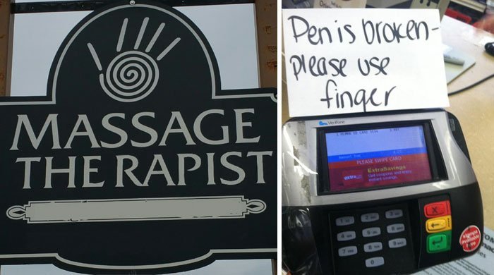
#1 What Style Of Massage Is This?

#2 Another Reminder That Yes, Fonts And Kerning Matter

#3 Spacing Is Important

#4 I’m Sorry, What’s Broken?

#5 Badly Misspelled Name

#6 My Math Teacher Also Taught Us The Importance Of Kerning

#7 Bull Titan Us

#8 Space Bar, You Had One Job

#9 Hey Walmart… Kerning Is Important

#10 Worst Tart Ever

#11 My Aunt In The Philippines Made A Nice Birthday Cake For My Relative Curt

#12 Sign Above The Megaflicks Store

#13 Bad Kerning, Good ‘shrooms

#14 Lego Click Brick


